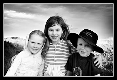
A few B&W's. HHCC Please
These certainly aren't technical perfect (or even that good), but i'm kinda going more for atmosphere and feeling rather than technical excellence. They are pretty grainy and the burning is less than subtle. But please let me know what you think. ALL HHCC WELCOME AND APPRECIATED. Thanks. The first one is my kids and second one is my DD's soccer team and the coach.


9 comments:
Lovely, the top one is gorgeous.
B&W is so HARD. It is my current goal right now and the progress is slow! I think the first one looks good. The girls are clear and crisp. The second one has to much contrast, the darks are to dark. Now you will probably get a very opinion for most Peas because this is pretty hot right now. I'm an old fashioned girl and want my photos to still look timeless years from now.
nice black and whites. I always love them. Your blog header is gorgeous!!!!!!
OH, I love them... they seem possibly a tad dark, but I really like them!
how do you do what you do patti???!!!! they are great!
These are great! That first one is awesome!
One thing I noticed right away is how nicely contrasted the BnW are, but...they actually could have too much contrast. It happens in BnW all the time, where the whites get blown a bet.
I really like that second shot, there's some good storytelling there.
I love your header!! Both of these b&w are wonderful. I like the comp on the soccor shot. SO cute to see so many kids still and listening.
Post a Comment